Consistent design isn’t about perfection—it’s about creating a calm, predictable experience. When you’re juggling multiple screens or teams, it’s easy to feel like every button needs its own personality. But consistency doesn’t require a color chart for every shade of blue.
A small shift can make all the difference.
Start with Your Core Elements
Instead of trying to control everything at once, identify your most-used components: buttons, icons, and text styles. These are the building blocks that appear across your product.
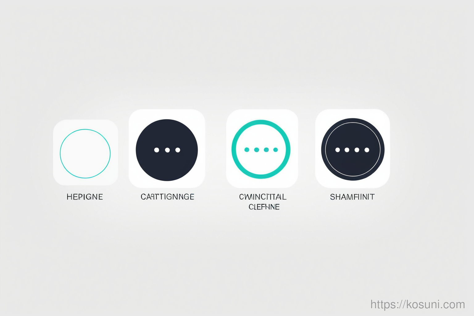
Create a Living Style Guide
A style guide isn’t just for designers—it’s a tool for everyone on your team. Keep it simple: list only what you actually use, not everything you might want to use someday.
- Color palette with primary and secondary options
- Font sizes for headings, body, and captions
- Spacing values (e.g., 8px grid system)
Use a Grid System for Layouts
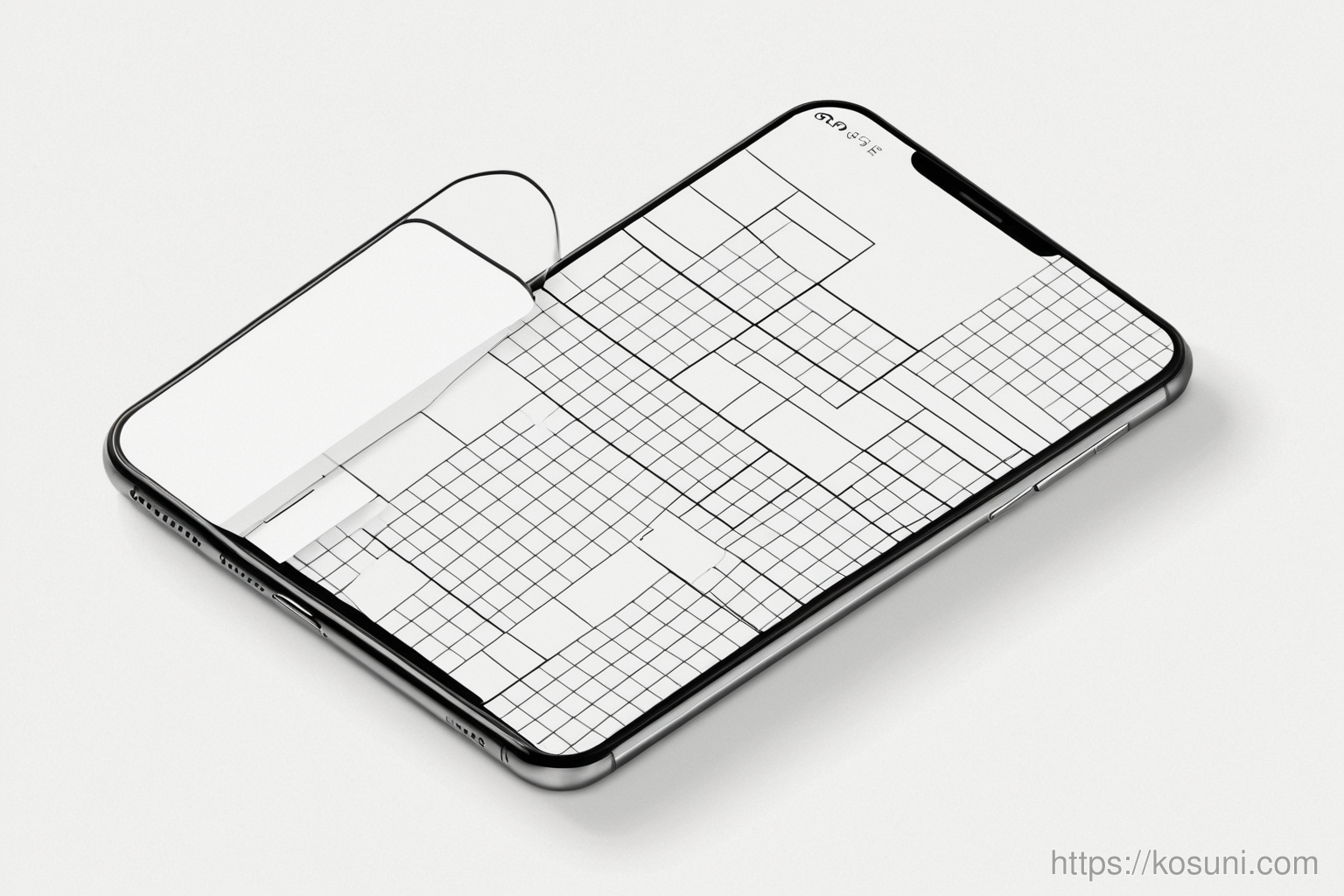
A consistent grid helps align elements without needing to measure each time. It’s like having a map for your design—no guesswork, just predictable spacing.
Test Your Consistency in Real Flows
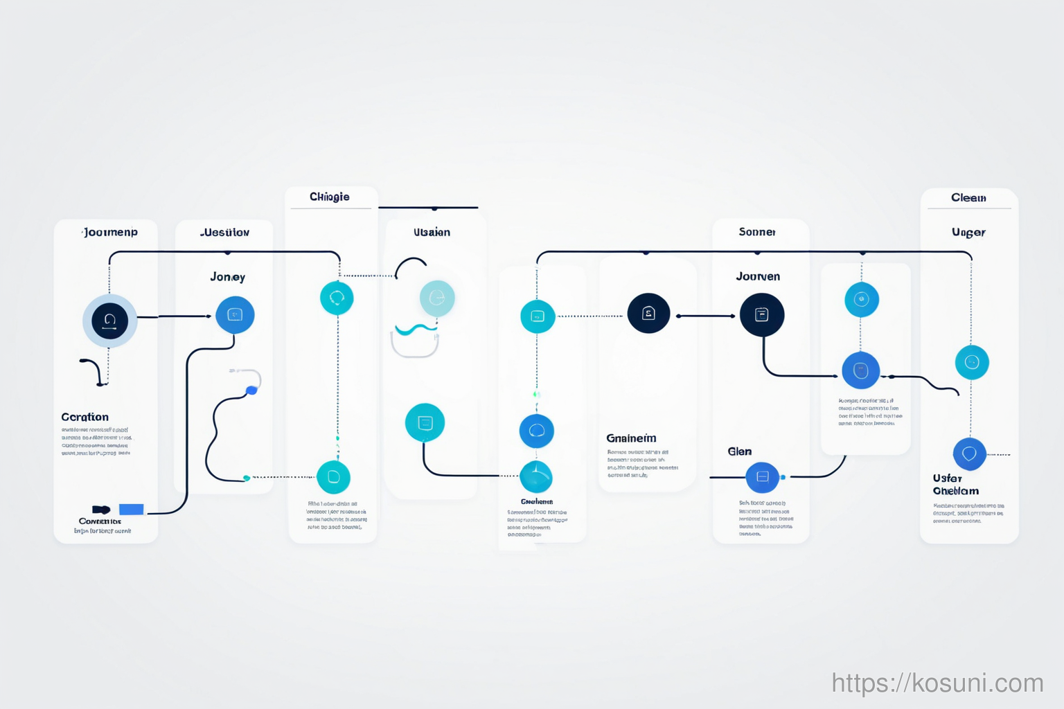
Instead of checking individual screens, walk through real user journeys. Do the same button style appear across all checkout steps? Is text size consistent when switching between mobile and desktop?
Automate What You Can
Tools like Figma or Adobe XD let you create reusable components. Once set up, these elements update everywhere they’re used—no more manual tweaks.
Keep It Simple and Evolve
Consistency isn’t a one-time setup. As your product grows, revisit your style guide every few months. Add new elements only when they’re truly necessary.