Here’s a one-page cheat sheet you can keep next to your code.
Goal in one line: the same tasks should be possible with a keyboard, a screen reader, and different vision/hearing needs—without guesswork.
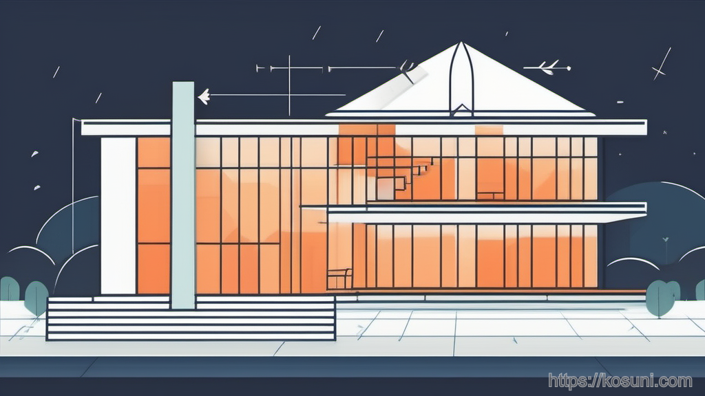
The “building” mental model (fast mapping)
Use this analogy when you’re unsure what to fix first.
- Headings = floor directory signs (people scan to understand what’s on each “floor”).
- Landmarks (header/nav/main/footer) = wings of the building (quick jumps to areas).
- Links/buttons = doors and switches (must clearly say what they do).
- Focus state = where you are standing (keyboard users must always see it).
- Alt text = label on a picture frame (what’s the point of the image?).
- Forms = service counter (labels, instructions, error messages matter).
Page structure: headings and landmarks (your “sign system”)

- Use one clear H1 that matches the page’s purpose (like the building name at the entrance).
- Keep heading levels in order (don’t jump from H2 to H4 unless there’s a real reason).
- Don’t use headings for styling; use them for outline and meaning.
- Use semantic regions (header/nav/main/footer) so assistive tech can jump around quickly.
Quick self-check: if you remove all CSS, does the page still read in a sensible order?
Keyboard access: focus, order, and “can I do the whole task?”
Keyboard access is the “ramps and wide doors” of the web: it’s not optional, and you notice it most when it’s missing.

- Visible focus: don’t remove outlines unless you replace them with an equally visible indicator.
- Logical tab order: the focus should follow the visual and reading order.
- No keyboard traps: you must be able to tab into and out of menus/modals.
- Skip link: add a “Skip to content” link so users can bypass repeated navigation.
Fast test: unplug your mouse (or just don’t touch it) and try to complete the main flow in under a minute.
Text, contrast, and spacing: make the “signs” readable
Think of this as lighting and legible signage. If the sign is technically there but hard to read, it fails in practice.
- Don’t rely on color alone to show status (add icons, text labels, patterns).
- Respect zoom: layouts should work at 200% without hiding content or requiring sideways scrolling (especially for text blocks).
- Prefer real text over text-in-images so it can scale and be read by assistive tech.
- Give breathing room: cramped line height and tight spacing can be as bad as low contrast.
Simple rule: if you’d struggle to read it on a sunny day, it probably needs improvement.
Images and icons: the “label on the frame” rule
Alt text isn’t a caption. It’s a replacement for the image when the image can’t do its job.
- Informative image: describe the meaning relevant to the page (“Line chart showing signups rising after April”).
- Decorative image: use empty alt (or CSS background) so it’s skipped.
- Icon-only button: give the control an accessible name (“Search”, “Close dialog”), not “magnifying glass”.
Good question to ask: if the image didn’t load, what would the user need to know to keep going?
Forms and errors: “service counter” basics people actually need

- Every input needs a real label (placeholders don’t count as labels).
- Instructions must be programmatically connected to the field when possible (so screen readers announce them at the right time).
- Error messages must say what happened and how to fix it (not just “Invalid”).
- Don’t wipe user input after an error—keep what they typed.
- Use the right input types (email, tel) to improve keyboard/mobile entry and validation.
Mini test: can you submit the form wrong on purpose and still recover quickly?
ARIA: treat it like “special signage,” not the building itself
ARIA is helpful when you’re building custom components. But if you can use native HTML, do that first.
- Prefer native elements (button, a, input, select) because they come with built-in keyboard and semantics.
- Don’t add ARIA to fix layout; ARIA is about meaning and interaction, not appearance.
- If you use role, you usually also need correct keyboard behavior and states (like expanded/collapsed).
Rule of thumb: “No ARIA is better than bad ARIA.”
10-minute checklist (the “walkthrough” you can repeat)
Run this when you finish a page or review a PR. It catches a lot without special tools.
- Can you reach everything with Tab and activate with Enter/Space?
- Is there a visible focus indicator at all times?
- Does the page have a single clear H1 and sensible heading order?
- Do links/buttons have specific names (avoid “Click here”, “Learn more” without context)?
- Do images have meaningful alt (or empty alt if decorative)?
- Can you zoom to 200% and still read/use the page?
- Do form errors explain what and how to fix?
- Is any info conveyed by color only?
Takeaway: aim for “no special instructions needed”
Good accessibility feels like a well-designed building: clear signs, predictable controls, and multiple ways to get where you’re going.
If you only fix three things this week, fix headings, keyboard focus, and form labels/errors.