Design consistency matters more than you might think. It’s not just about making things look pretty—it’s about creating a predictable experience that users can rely on.
A little effort now saves hours of rework later.
Start With Your Core Components
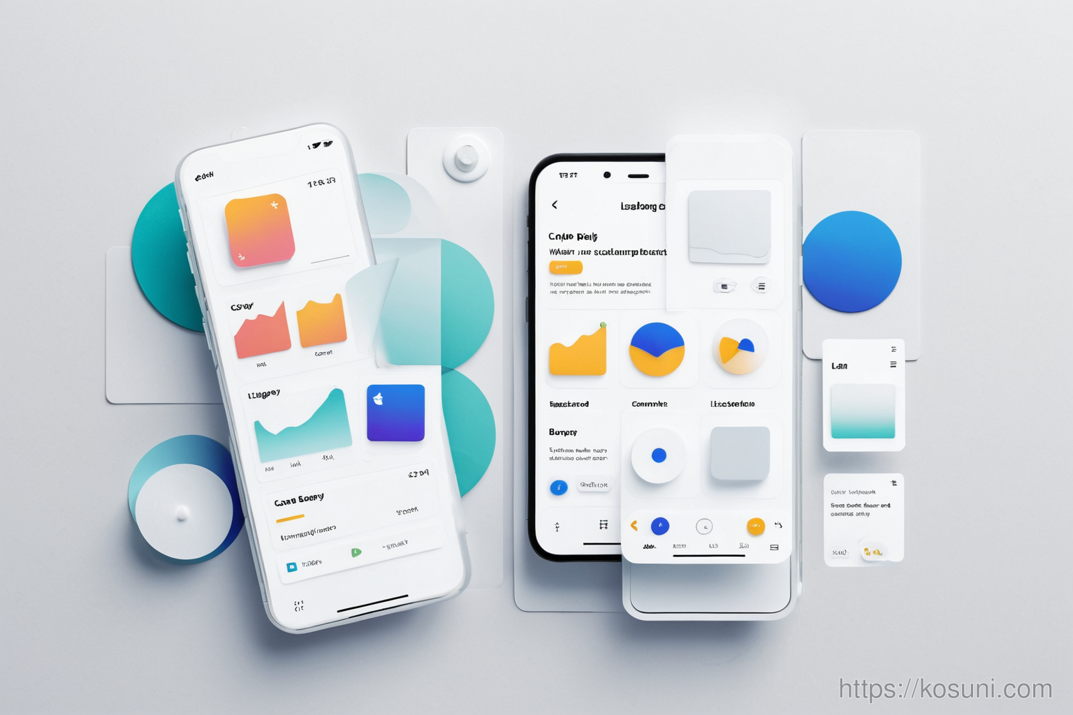
Before diving into layouts or colors, identify the core UI elements you’ll use repeatedly—buttons, cards, headers, and input fields. These are your building blocks.
Define a Spacing System
Spacing isn’t just about padding. It’s a language of rhythm and balance. Use consistent spacing units across your app to create visual harmony.
- Start with a base unit (e.g., 4px or 8px)
- Use multiples of that unit for all spacing
- Avoid mixing pixel values like 10px or 25px
Typography That Works Together
Fonts aren’t just about style—they’re part of your visual language. Choose a limited set of font weights and sizes that complement each other.

Create a Color System, Not Just a Palette
A color system is more than a list of hex codes. It’s about how colors function in your app—what they communicate and when to use them.
- Use primary for key actions (e.g., main buttons)
- Use secondary for less important interactions
- Define error, success, and warning states clearly
Patterns: The Invisible Thread
Repeating visual patterns—like rounded corners or shadow styles—help users recognize system behavior without thinking.

Checklist for Consistency
- Are all buttons the same height and padding?
- Do all headers follow the same typographic hierarchy?
- Is color used consistently to indicate state or importance?
Keep It Simple, Not Perfect
You don’t need a perfect system from day one. Start small, document what you use, and evolve it as your app grows.