If an Android screen feels “off,” it is often not one big problem. It is usually a few small mismatches in spacing, type, color, or repeated patterns.

This guide gives you a simple way to spot those mismatches without getting lost in design jargon.
What design consistency actually means
Consistency means the same kind of thing looks and behaves the same way every time.
On Android, that might mean buttons share the same size, headings follow the same style, and similar actions use the same placement.
When consistency is strong, people do less re-learning as they move through the app.
When it is weak, the interface feels slightly unpredictable, even if each screen looks fine on its own.
Start with spacing and alignment
Spacing is one of the fastest ways to judge whether a design feels tidy or improvised.
Look for repeated gaps between cards, labels, buttons, and sections. If one screen uses roomy spacing and the next feels cramped, that difference stands out quickly.
Alignment matters too. Edges that line up help the eye move smoothly across the screen.
A useful question is simple: do the main elements feel like they belong to the same system?
Check type sizes and text hierarchy
Type hierarchy is how the screen tells you what matters most.
Headings should look like headings. Supporting text should look quieter. Button labels should be easy to scan without shouting.
If too many text styles compete, users spend extra effort figuring out what to read first.
Watch for these common problems:
- Headings that change size from screen to screen
- Body text that is too small in dense layouts
- Labels that use the same weight as primary actions
- Mixed capitalization styles without a clear reason
A consistent text system usually feels boring in the best way.
Look at color as a function, not decoration
Color should help people understand meaning, status, and action.
Primary actions usually need one clear color. Alerts need a different tone. Disabled items should look intentionally quieter, not accidentally broken.
If every element is colorful, nothing feels important.
If color rules keep changing, the screen loses its visual logic.
A good test is to hide the words for a moment and ask what the colors are trying to communicate.
Compare repeated components across the app
Repeated components are the places where inconsistency becomes obvious.
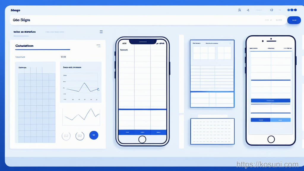
Buttons, cards, toggles, navigation items, and form fields should feel like they came from the same family.
Even small differences can add up. A button that is taller on one page and narrower on another can make the whole app feel patched together.
Use this quick checklist:
- Do similar buttons use the same shape and padding?
- Do cards handle titles and subtitles the same way?
- Do form fields behave the same on focus and error?
- Do icons use a matching visual weight?
- Do primary actions stay in the same location?
Spot pattern breaks before they spread
Pattern breaks happen when one screen ignores the established rule.
Sometimes that is intentional. More often, it is a sign that a component was built separately and never brought back into the system.
One odd screen is not always a crisis. Several odd screens usually mean the design system is drifting.
If you are reviewing a product, note whether the break is isolated or repeated.
A quick way to review any Android screen
When you need a fast pass, review the screen in this order: spacing, text, color, components, then pattern breaks.
That sequence keeps you from over-focusing on decoration before the basics are stable.
Takeaway
Good design consistency is less about making everything identical and more about making similar things predictable.
If spacing, type, color, and repeated components all follow the same logic, an Android interface usually feels calmer and easier to trust.