DevOps metrics are supposed to reduce arguments, not start new ones. But if you’ve ever stared at a dashboard on your iPhone and thought “is this good or just… a lot of charts?”, you’re not alone.

This guide explains the most common metrics and terms in plain English, using a scorecard format so you can compare “helpful signal” vs “busywork.”
One sentence to keep in mind: a metric is only useful if it changes what you do next.
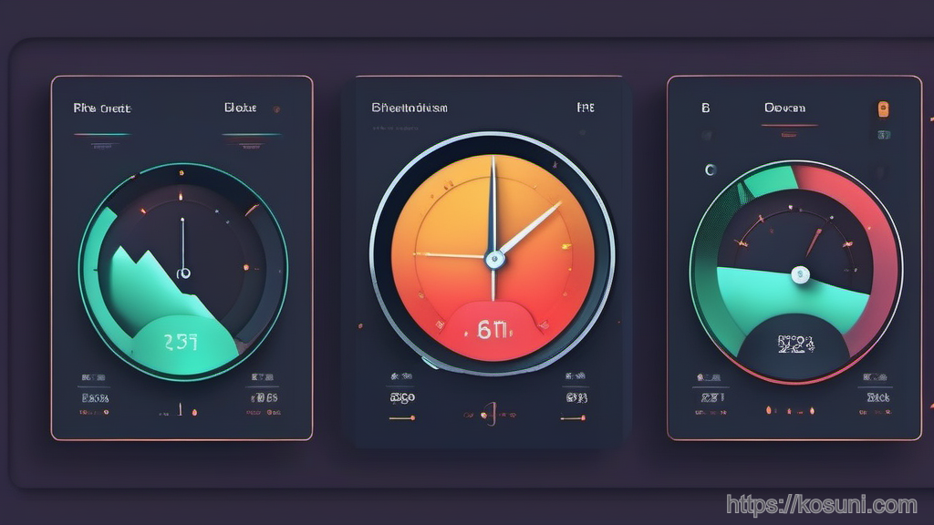
Before we start, quick context: on iOS you’ll often view these in mobile-friendly views of Google tools (Google Cloud Monitoring dashboards, Looker Studio reports, Google Sheets scorecards, or even shared links in Google Chat). The concepts stay the same.
The scorecard: how to judge any DevOps metric (0–2 points each)
Use this as a lightweight rubric. A “good” metric doesn’t need to be fancy—it needs to be decision-ready.
- User impact clarity: 0 = unclear, 1 = indirect, 2 = directly maps to user experience
- Actionability: 0 = interesting, 1 = sometimes actionable, 2 = has a clear owner and playbook
- Gaming resistance: 0 = easy to “improve” without real improvement, 1 = somewhat gameable, 2 = hard to fake
- Stability: 0 = noisy, 1 = moderate noise, 2 = stable enough to compare week to week
- Cost to measure: 0 = expensive/complex, 1 = moderate, 2 = cheap and low-maintenance
If a metric totals 8–10, it belongs on a shared scorecard. If it’s 5–7, keep it for debugging. If it’s 0–4, treat it as a vanity chart until proven otherwise.
SLO, SLI, and SLA: the “promise stack” (and what each one is for)
These get mixed up constantly, so here’s the simplest way to separate them.

- SLI (Service Level Indicator): the raw measurement. Example: “% of requests under 300 ms” or “% of successful logins.”
- SLO (Service Level Objective): the target you aim for. Example: “99.9% of logins succeed over 28 days.”
- SLA (Service Level Agreement): the external contract (often with penalties). Example: “If uptime drops below 99.9%, customer gets credits.”
Scorecard note: SLOs are usually high-scoring because they connect technical reality to a clear “are we meeting expectations?” question.
A useful mental model: SLI is the thermometer, SLO is the healthy range, SLA is the paperwork.
Error budget: the “permission slip” to change things
Error budget sounds negative, but it’s actually how you keep reliability work from becoming endless fear of shipping.
Plain English: if your SLO is 99.9% over 30 days, you’re allowed 0.1% “badness” in that window. That allowance is the error budget.

- If you’re spending error budget fast, slow down risky releases and prioritize stability.
- If you’re not spending any, you may be over-investing in caution (or your SLO is too easy).
Scorecard note: error budget is hard to game and highly actionable—when it’s tied to real user-facing SLIs.
MTTR, MTTD, and MTBF: incident time metrics without the confusion
These acronyms are everywhere. The trap is treating them like “team grades” instead of system signals.
- MTTD (Mean Time To Detect): how long a problem exists before you notice.
- MTTR (Mean Time To Restore/Recover): how long until service is back to acceptable.
- MTBF (Mean Time Between Failures): average time between incidents.
How to use them without getting misleading results:
- Segment by incident type (deploy-related vs third-party vs capacity). One blended MTTR hides the story.
- Track medians and percentiles, not just averages. One multi-day incident can distort the mean.
- Define “restore”. Is it “alerts stopped” or “user impact resolved”?
Scorecard note: MTTR can be good, but it’s somewhat gameable if teams “stop the bleeding” without fixing underlying causes. Pair it with post-incident follow-through.
DORA metrics, translated: what they really tell you (and what they don’t)
DORA metrics are popular because they’re simple and comparable across teams—but only if you define them carefully.
- Deployment frequency: how often you release. Useful for seeing bottlenecks, but easy to game by shipping tiny changes.
- Lead time for changes: time from “code committed” to “running in production.” Great for spotting review/CI/release friction.
- Change failure rate: % of deployments that cause incidents, rollbacks, or hotfixes. Strong quality signal if your definition of “failure” is consistent.
- Time to restore service: basically MTTR, but in the DORA set.
Scorecard note: the best pairing is deployment frequency + change failure rate. Speed without safety is chaos; safety without speed can turn into stagnation.
Latency, throughput, errors, saturation: a practical “what’s wrong?” map
If you only remember one diagnostic set, remember these four. They help you ask: is the system slow, busy, failing, or out of room?
- Latency: how long requests take. Watch p95/p99, not just average.
- Throughput: how much work is happening (requests per second, jobs per minute).
- Errors: failures (5xx, failed tasks, exception rate). Define which errors matter to users.
- Saturation: how close you are to capacity (CPU, memory, queue depth, DB connections).
Scorecard note: these are excellent for on-call response, but they need context to become leadership metrics. For example, “CPU 85%” is not automatically bad if latency and errors are fine.
Takeaway: build a “one-screen” scorecard you can trust
On iOS, the winning setup is usually a single, mobile-readable page (often a Google dashboard link) that shows: your SLO status, error budget burn, a couple DORA metrics, and the four golden signals for your critical path.
When in doubt, keep metrics that answer: Are users okay? and Do we know what to do next?
If a number can’t do either, it belongs in a debugging view—not the main scoreboard.