
When an iOS app feels “easy,” it’s usually not magic design—it’s just that the app behaves like a familiar place. You always know where you are, what you can do next, and how to get back.
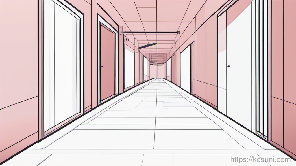
Let’s use a simple analogy: your app is a hallway with doors and signs.
Once you can picture the “hallway,” navigation decisions get a lot less abstract.
The mental model: hallway = primary path, doors = choices, signs = cues
Imagine a hallway in a building:
- The hallway is the main path most people follow (your primary navigation).
- Doors are the places people can enter (screens, flows, detail views).
- Signs are the cues that prevent confusion (labels, icons, headings, back button titles, page titles).
Good iOS UX makes that building feel consistent. You shouldn’t need courage to tap something.
A practical test: if someone can’t answer “Where am I?” within 2 seconds, your hallway needs better signs.
Pick one “main hallway” per app area (and don’t change it mid-walk)
Beginners often create multiple competing hallways: a tab bar, plus a side menu, plus a floating button that goes somewhere unrelated. That’s like walking and having the corridor split into three unmarked corridors.
On iOS, common “main hallway” patterns are:
- Tab bar for top-level areas (Home, Search, Saved, Profile).
- Single stack when the app is basically one continuous journey.
- Split view for iPad-heavy experiences (list on left, detail on right).
Rule of thumb: if a user is doing one job (order food, read news, track tasks), keep them in one hallway and open doors off that hallway.
Also: don’t move the exits. If “Saved” is a tab, don’t also hide “Saved” inside Settings.
Make doors look like doors: tappable things must look tappable
In hallway terms, a “door” should look like something you can open. In iOS UX, people expect specific affordances.
- Rows in a list feel tappable when they’re full-width and consistent.
- Buttons should look like buttons (shape, fill, or clear label).
- Links should look like links (color + placement + wording).
- Cards can be tappable, but only if they behave consistently across the app.
Common beginner trap: making important actions look like plain text. That’s like putting a door handle on the wall paint.
Quick check: can you screenshot a screen and circle everything tappable without hesitating? If not, users will hesitate too.
Give every door an “I can get back” guarantee
A lot of iOS anxiety comes from fear of getting stuck. Your job is to make backing out feel safe and predictable.
- Use a clear back path (navigation bar back button, close button for modals).
- Don’t hijack back behavior in surprising ways (like back suddenly opening a different tab).
- Keep titles stable so the back button label makes sense.
- Preserve progress when reasonable (scroll position, search filters, draft text).
Analogy: if you open a door to check a room, you expect the hallway to still be there when you step back out.
One-sentence heuristic: every screen should answer “How do I leave?” with zero thinking.
Signs should be boring (in a good way): labels beat cleverness
Signs are not the place to be witty. Most navigation friction is language friction.
- Prefer familiar words (“Search,” “Saved,” “Settings”) over brand-y terms (“Discoveries,” “Vault,” “Control Center”).
- Match the user’s goal (“Track order”) instead of internal system terms (“Logistics”).
- Keep similar things named similarly (don’t mix “Favorites,” “Saved,” “Bookmarks” unless they’re truly different).
If you’re using Google surfaces on iOS (like sign-in, web views, or account-related flows), keep labels consistent with what people already recognize from Google—without copying UI blindly. Familiar terms reduce cognitive load.

Simple test: ask someone to predict what a label does before they tap it. If they guess wrong, it’s a sign problem, not a “user problem.”
A 10-minute checklist to sanity-check your iOS navigation
- One hallway: Can you describe the primary navigation in one sentence?
- No surprise doors: Do tappable areas look tappable and behave consistently?
- Clear exits: Is there an obvious back/close on every screen?
- Stable location: Does the user always know where they are (title, selected tab, context)?
- Predictable wording: Are labels literal and consistent?
- Same action, same place: Is “Save” always in the same general spot and style?
- Recovery: If they back out, do they lose work or context unnecessarily?
If you can’t confidently check a box, that’s your next UX improvement. Fixing two items here often makes the whole app feel calmer.
Takeaway: build a place, not a puzzle
Beginner-friendly iOS UX is mostly about reducing “Where am I?” and “What happens if I tap this?” moments.
Design one hallway, make doors look like doors, and use boring signs that tell the truth.